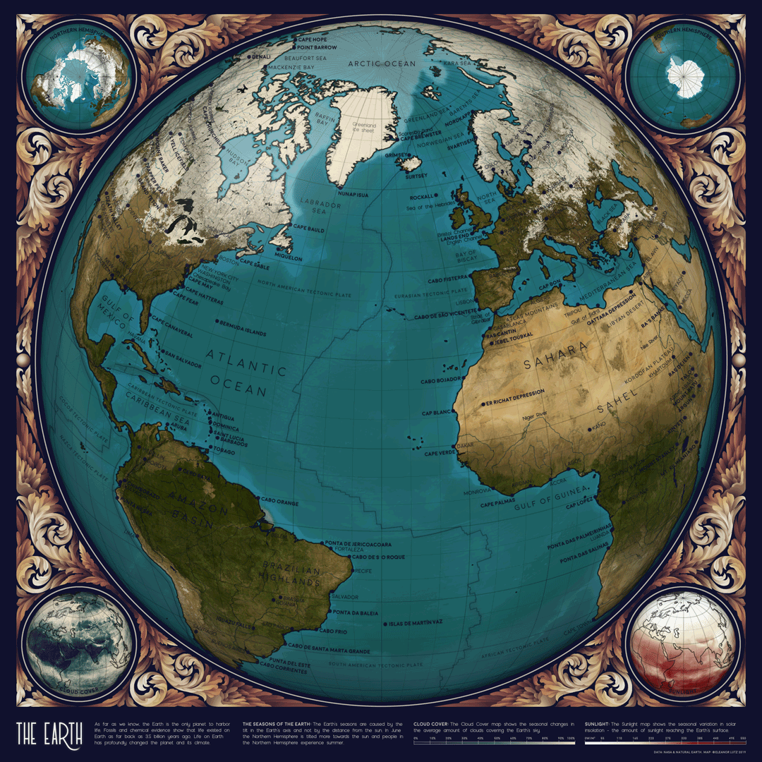
This animated map of Earth shows changes in Arctic sea ice and vegetation throughout the seasons. Each frame in the GIF shows one month out of the year. The map is made using open data from NASA, USGS, and Natural Earth. I've open-sourced all the code here in a detailed design tutorial, and you can buy a poster or print of the map here if you'd like. .
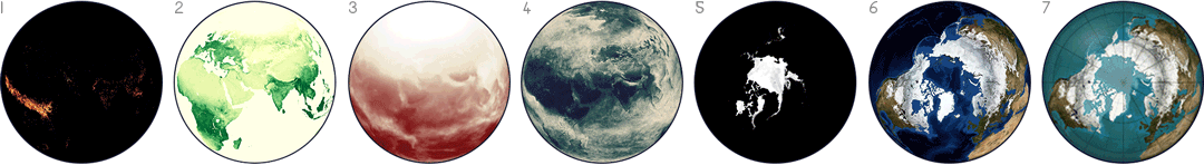
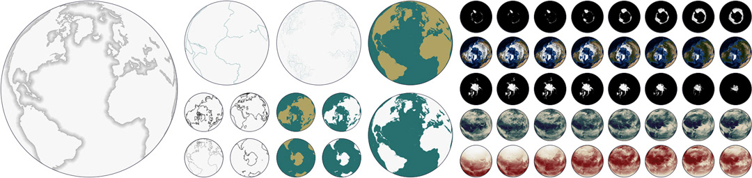
To design this map I first looked through the NASA Earth Observations data collection to find seasonal datasets. Some of the most interesting ones I found were fire prevalence (1), vegetation (2), solar insolation (3), and cloud cover (4). For my animation I added the sea ice dataset (5) to the Blue Marble dataset (6) as my own combination map (7).
I also used data from Natural Earth and the USGS for the tectonic plates, coastlines, and feature labels. The final scrollwork illustration consists of many grayscale shapes layered together, combined with multiple color overlays.
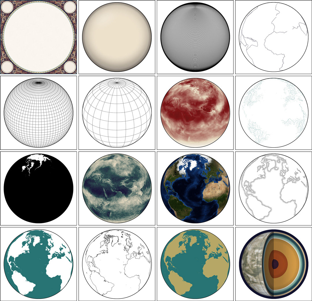
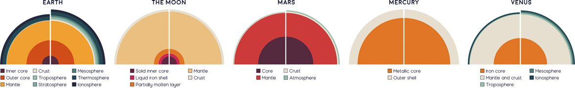
I also designed a cutaway diagram showing the interior layers of Earth. This figure were a little tricky because some of the layers on Earth were so thin that they were virtually invisible. To show even the thinnest layers, I designed an adjusted diagram in Python where every layer has a minimum visible thickness. Below, the left half of each figure shows the actual thickness, and the right half shows an adjusted version where each layer has a minimum thickness. Four other planets are shown using the same code for comparison.