As a client project for Nerdcore Medical, I designed a pair of infographics to visualize ECG and PCG waves as a study guide for medical students.
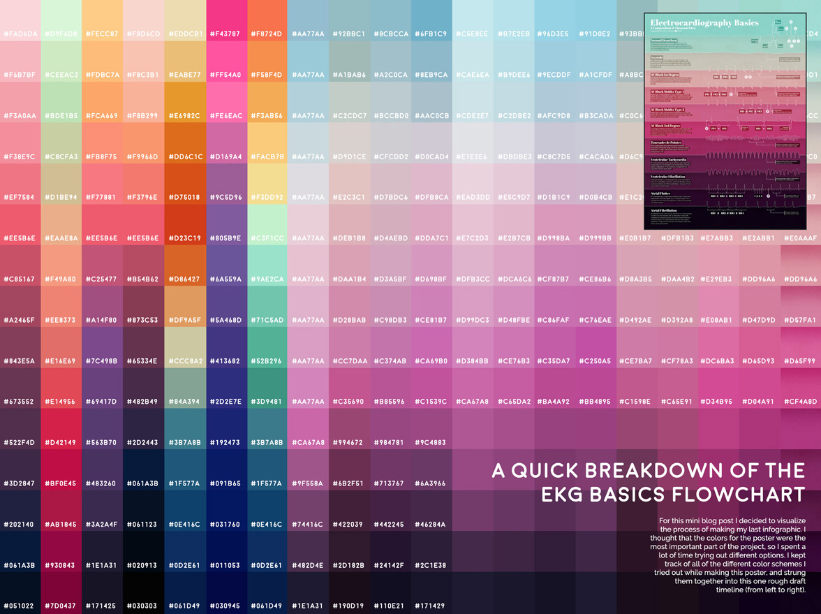
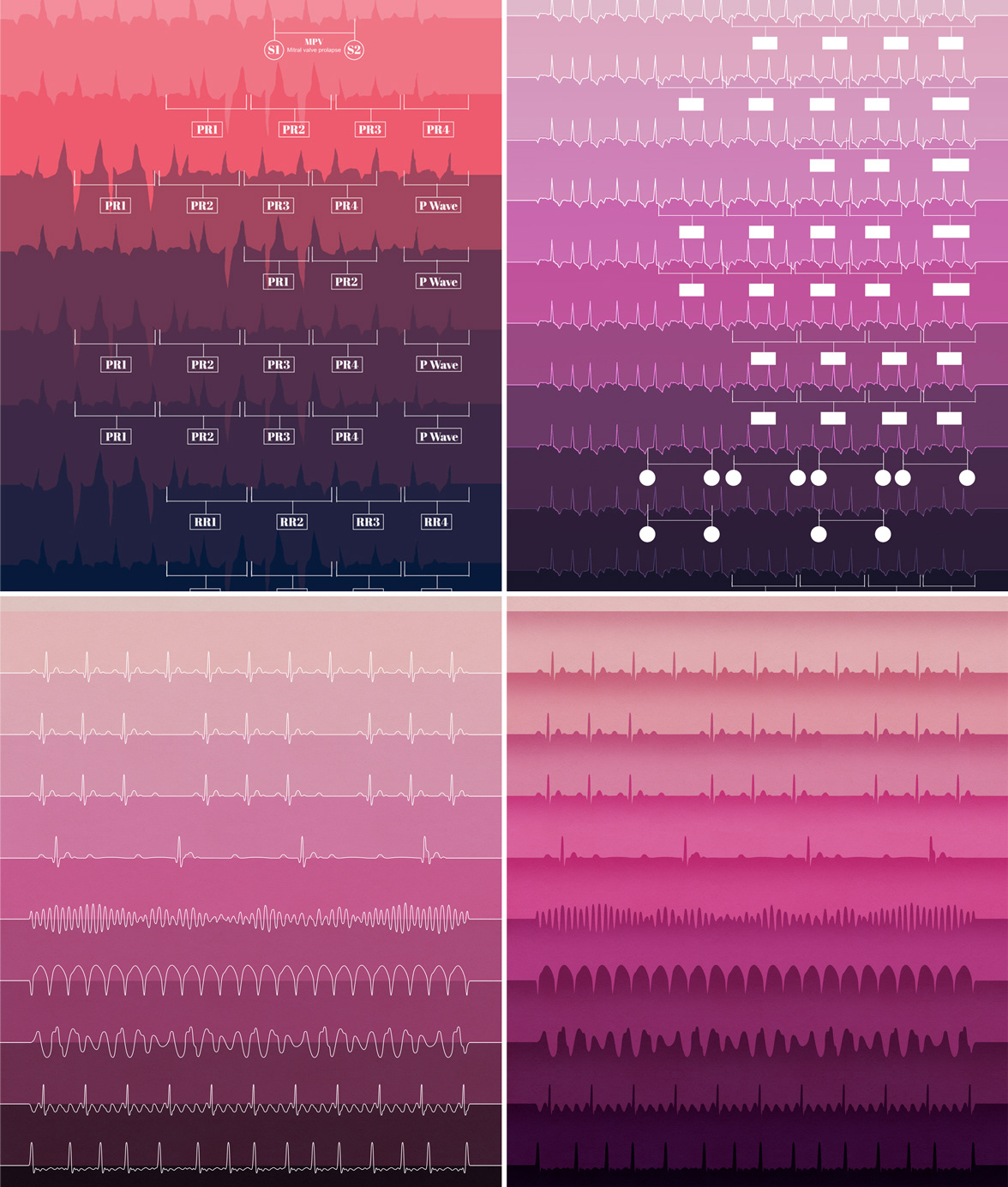
I wanted to highlight the unique shapes of each wave as the focal point, by creating a gradient where each of the waves defined a specific colorful section of the poster. I thought it would show off the simple shape of the waves, and also work as a practical way to section off the different descriptions.
To provide a reference for a healthy heartbeat, the first entry in the infographic is an EKG trace from a normal adult. The following 10 entries are all examples of abnormal EKGs.
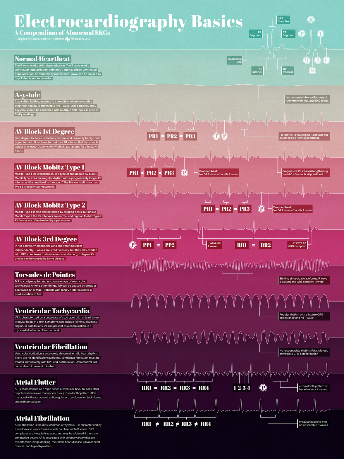
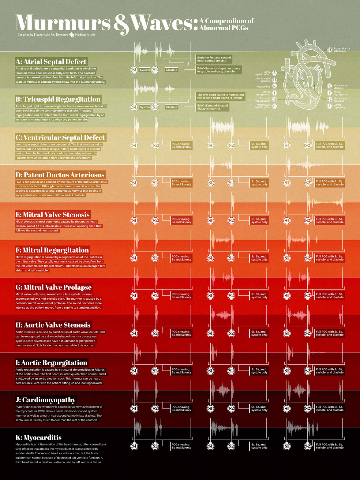
After designing the overall layout, I tried many different color schemes before finally picking two - one to visualize the ECG poster, and one for the twin PCG poster. I designed each line in Illustrator, and then imported the shapes to Photoshop to add textured shadows, color overlays, and text.